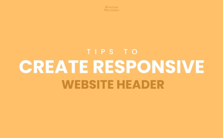
Create Responsive Website Headers
Do you want to increase organic reach of your website? What all you need to do for increasing organic traffic? Here is the super smart solution, exclusively given by Rwkstar Networks – Online Digital Marketing Company India. There are some amazing tips to create responsive website headers that you need to know as a developer or user interface designer.
Creative Website Headers Tips – Have a quick look!
Check out the Infographics to have a quick view on the tips that you can follow:

1. Margin/Grid/DIV
To create responsive website headers, you must concern about the technical aspects. The most common one is, your header should be in between Margin/Grid/Div. If you do not consider about this technical aspect then your website will not look responsive. Less people will stay on your web pages. Thus, make sure you keep this point in mind when make a website.
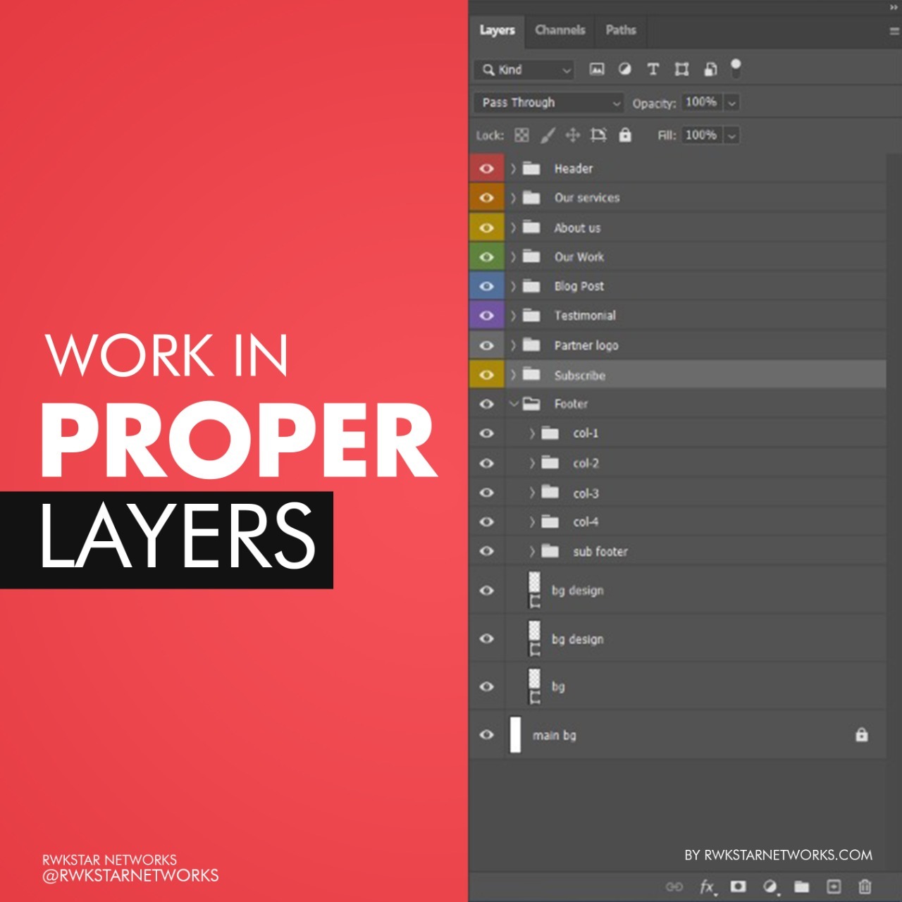
2. Make layers to create responsive website headers
You should work in proper layer to design your website header more conveniently and easily without any delay or confusion. It is a point for which you need to take care when you design your web template in adobe photoshop. Doing so will allow you to make it more easily.
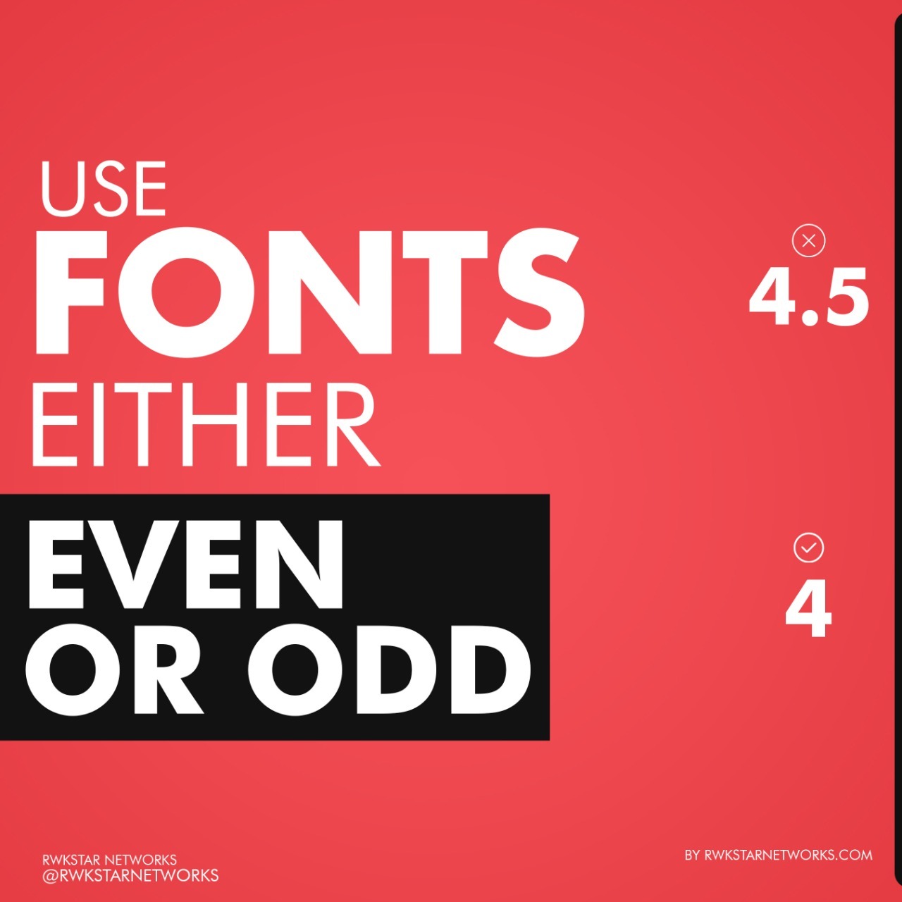
3. Use Font carefully
You must concern about the font sizes while making website headers for your website. It should be either even or odd. For instance, It should be 1, 3, 16, 20, etc. Instead of 4.5, 3.7, 2.95, 22.5, etc.

4. Use alluring images
If you are wondering about How to increase website traffic, then I t is important to use attractive or alluring images to create responsive website headers. It is so, because such images can convince the audience to stay at your website.
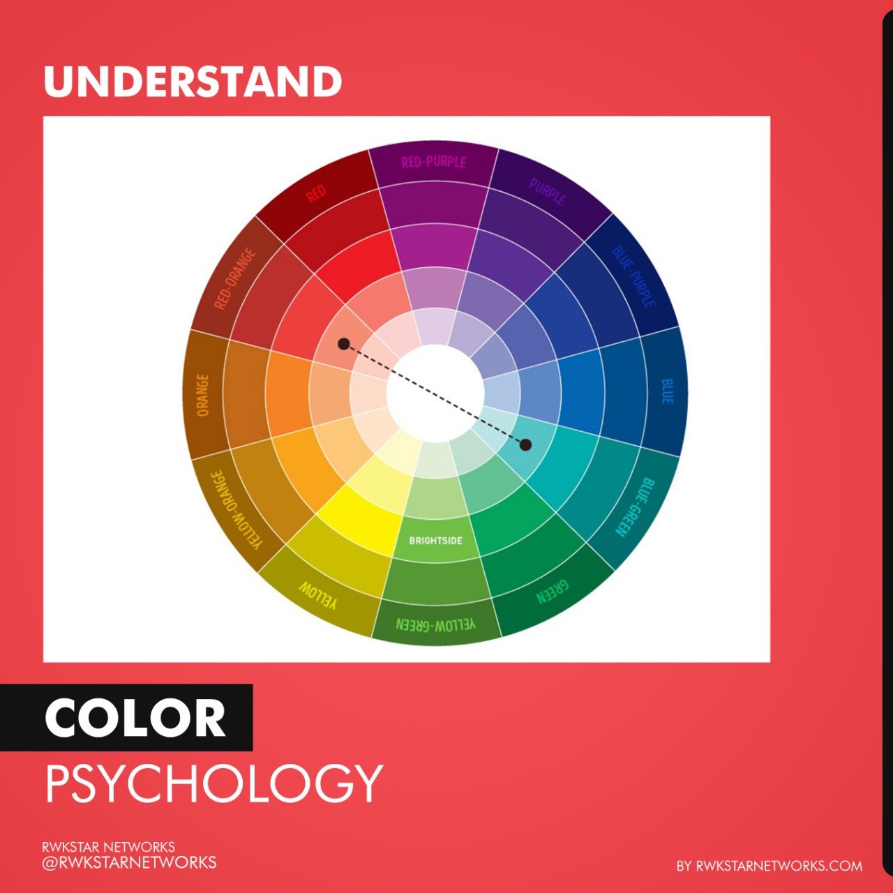
5. Play Color Psychology
You can master in your website header by using color psychology. Different colors can make different impacts on the mind of audience. So, choose colours accordingly.
6. Logo is must in Creative Website Header
Do not forget to put logo on your website header template. It increases the level of identification to your brand. The more you focus your brand, the more recognition you get.

7. Use action buttons on Website Headers
Do not forget to put action button when you create responsive website headers. It allows the users quick access to your website. People like one click actions.

8. Verify you Website Headers
Once you complete your responsive website header, you must verify it using the above shown tools. These can guide you in a better way possible to make your template more responsive.
Why choose us?
In this section, we gonna tell you about why you should choose us as Digital Marketing Company in India, to create responsive website header for your website. We as Rwkstar Networks, have a team of youngsters who invest much of their time on research in their respective fields. That is why, we would always recommend you the latest trends for your web platforms based on the latest research. For a website or design to be responsive, one must be updated.
So, we would be glad if you choose us as your website designer as we are willing to research for you with what we know and what more we can know.
Stay Tuned!
The above-mentioned info-graphics are giving a very quick view on how to create responsive website headers. We, Rwkstar Networks – Online Digital Marketing Company India, will always be ready to provide such informational graphics, so that you can get some useful content for the betterment of the skills. Also, stay connected via:
Facebook | Instagram | Twitter
How fonts create responsive website header?
Fonts play a very major role in create a responsive website header. As we all know that content is the king, so one needs titles or descriptions to find out relevant solutions to one’s search.


Write a Comment